maybe add a icon for "about" menu (v10.0)

Collapse
X
 
  • Time
  • Show
Clear All
new posts
  • item
    Active Community Member
    • Mar 2017
    • 1569

    #1

    maybe add a icon for "about" menu (v10.0)

    Hi Teams,
    maybe add a icon for "about" menu (info icon?)

    application/Espo/Resources/metadata/app/clientNavbar.json
    "iconClass": "fas fa-info-circle"

    best regards
    If you could give the project a star on GitHub. EspoCrm believe our work truly deserves more recognition. Thanks.​
  • yuri
    EspoCRM product developer
    • Mar 2014
    • 9902

    #2
    Hi,

    Maybe. I prefer without icon. We cannot cover all icons as we don't have many too choose from The idea to have icons only for actions that are meant to be performed very often. We have many menus where not all items have icons. Big menu where all items have icons are worse than big menus where only important items have icons I believe.

    It was made not for visuals but for accessibility.

    Comment

    • yuri
      EspoCRM product developer
      • Mar 2014
      • 9902

      #3
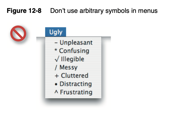
      I hope the current UI trend of adding icons in every menu items just because it looks kind of consistent will die out. It's not about accessibility but does the opposite effect. The icons were meant for accessibility. They allows users to recognize the needed action very quickly (miliseconds).

      If the about page is not meant to be clicked often, maybe even never, I don't see the need to have the icon there other than for visuals. But another problem is that we don't have a good choice for the About icon. The one we have is too bold, drawing attention from other much more important actions. Each added icon reduces scannability for other icons.

      Here are two articles I found which support my view.

      Writing about the big beautiful mess that is making things for the world wide web.


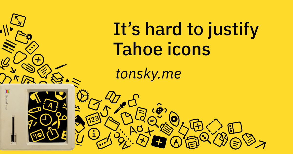
      Looking at the first principles of icon design—and how Apple failed to apply all of them in macOS Tahoe

      Comment


      • rabii
        rabii commented
        Editing a comment
        I totally agree with you. the about is not meant to be an action the user would often click on - it will be confusing to have an icon for about item. i honestly prefer the current design system for Espocrm super clean and well structured - interfaces are more focused on what the user should be doing rather than how fancy this button is. Super nice. well done to you and all the team.

      • item
        item commented
        Editing a comment
        Hi rabii, Yuri,

        i prefer too as rabii say "super clean and well structured"
        I just post because i think this was a "forgeted icon for about".

        "about" is orphan menu item without icon

        Best Regards
    • yuri
      EspoCRM product developer
      • Mar 2014
      • 9902

      #4
      That said had we an open source non-solid version of [i] icon, it would be a good fit there. Maybe in future we'll switch to another icon set with more lean icons, though switching icons is quite a time consuming task, if we want to aim near pixel perfection. The last time we migrated to another version of font awesome it took an effort to adapt the whole UI to match new icons.

      Click image for larger version

Name:	image.png
Views:	19
Size:	4.3 KB
ID:	127051

      Comment

      Working...