We just don't need the duplicate folders in the right hand side of List pages with Categories, like Documents.
We use the left-navigation to navigate, and expect the right side to show the content of that Category filter.
Right now it make no sense to the user trying to find Documents quickly. The interface seems to be trying to look like a file server - but the interaction is for data records with attachments, and there's no drag & drop that users would expect with folder icons, so maybe that interface icon is not appropriate.
It would just make more sense for the Categories to work as filters to show all the files within that parent category and all its children - or have a full list when no category filter has yet been selected, so we can have sorted to see the latest files.
I understand existing users may have become used to this slower way of working with documents, and maybe they have time to spare - so perhaps it can be a setting available to those of us that need to work in a different way, and at speed with larger amounts of data.
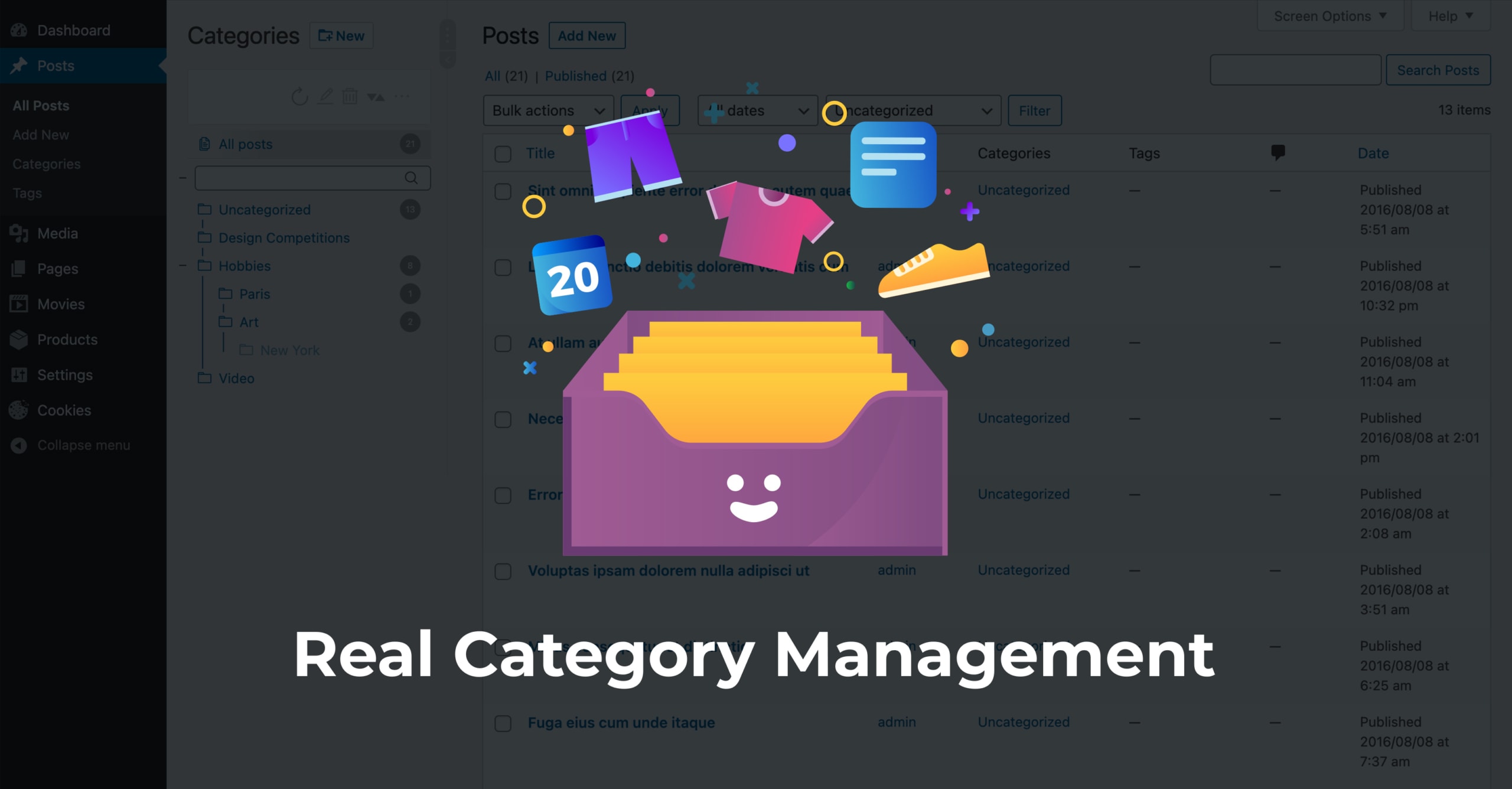
The best implementation of this sort of navigation I've worked with before is this Wordpress (sorry if it's a swear word here) Admin plugin:
There's also a dropdown at the top to use different fields as the left navigation filter, so you could perhaps switch between it being Folders / Tasks / or whatever other relationship.


Comment